Rethinking Everyday Tools with Inclusive Design Makeovers

Today we dive into Inclusive Design Makeovers for Everyday Tools, spotlighting practical ways to reduce strain, confusion, and exclusion in the objects we touch dozens of times each day. From kitchen gadgets to public buttons, we’ll explore ergonomic upgrades, sensory cues, clearer language, and affordable retrofits. Share your daily friction points in the comments, because your experience guides what we redesign next and helps others feel seen, safe, and supported.

Seeing Ordinary Objects Through New Eyes

Many tools fail not because people are clumsy or distracted, but because their form ignores diverse bodies, senses, and contexts. By examining a simple door handle, kettle, or card reader, we discover invisible barriers—pinch points, confusing icons, awkward angles—that can compound into daily fatigue. We’ll map when and where frustration peaks, turn those moments into design clues, and invite you to share photos of small failures so we can flip them into generous, welcoming details.

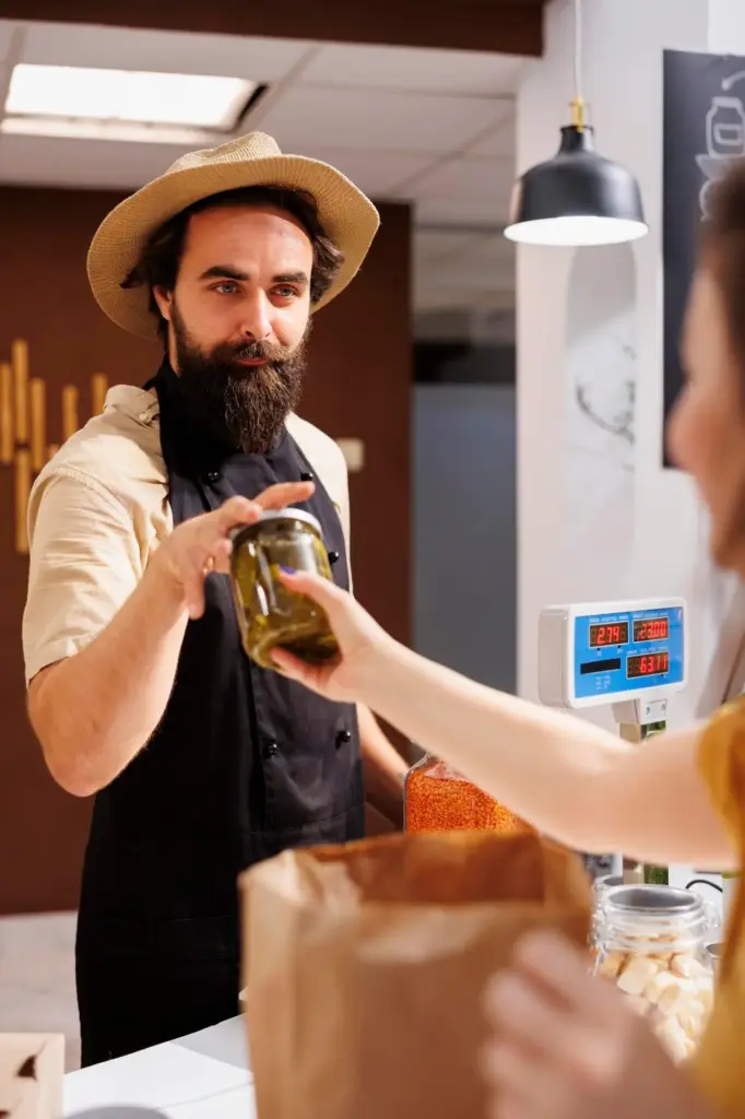
Ergonomics That Welcome Every Body

Ergonomics is empathy made tangible. Hands vary in size, strength, flexibility, and sensation; joints ache with age; fatigue arrives early for many. Design that honors these realities reduces injury and empowers independence. Think thicker, compliant grips; larger activation targets; and balanced leverage that multiplies available strength. We’ll highlight proven tweaks—oval profiles, soft-touch zones, detents you can feel, and motion paths that respect natural joints—so tasks demand less effort and deliver more dignity.

Sensory-Friendly Interfaces and Signals

Not everyone perceives the same signals clearly, especially under stress or glare. Layering feedback across senses—sight, touch, and sound—helps actions confirm themselves and errors reveal a path forward. We’ll examine contrast that survives poor lighting, tactile landmarks discoverable without vision, and audio cues that remain distinct in noisy rooms. Thoughtful redundancy does not clutter an interface; it builds confidence. Our examples show how calm, consistent signaling reduces cognitive load and prevents costly missteps.

Multimodal Feedback That Matters

Pair a gentle click with a subtle vibration and a visible state change, so activation is unmistakable even if one channel is missed. Avoid shrill tones; choose pleasant frequencies and short motifs that users can learn quickly. Provide silent modes relying on tactile cues for quiet environments. Use color as supplementary, not primary, so colorblind users are supported. Multimodal feedback transforms uncertainty into trust, especially when hands are wet, eyes are tired, or attention is divided.

High Contrast That Respects Real Light

Design for sunlight, dim corners, and reflective surfaces by choosing high luminance contrast and matte finishes. Use large, legible type with generous spacing, and avoid low-contrast pastels that vanish under glare. Backlighting should be even, not dazzling. Provide physical shading lips around displays where feasible. Test outdoors and near windows rather than only under ideal lab lighting. Real-world contrast ensures labels, icons, and states remain distinguishable during the exact moments when clarity is essential.

Tactile Landmarks and Discoverability

Add raised ridges, concave dimples, and edge chamfers that guide fingers to critical controls without looking. Distinct shapes for different functions reduce errors: a toggle feels unlike a confirm button. Use braille or raised text where appropriate, coupled with intuitive geometry for those unfamiliar with braille. Ensure tactile cues remain detectable through gloves. These landmarks provide confidence in darkness, during tremors, or when visual attention must stay focused elsewhere, greatly improving speed and safety.

Clear Language, Better Labels, and Universal Instructions

Words are part of the interface. Clear labels shorten learning curves and prevent hazardous mistakes. Plain language outperforms jargon, especially for rushed tasks or when English is a second language. Pair concise verbs with supportive visuals, and break procedures into small, numbered steps. Use consistent terminology across packaging, manuals, and apps to avoid cognitive switching costs. By telling a simple, coherent story about use, we make tools easier to trust, share, and repair.

Affordable Retrofits and DIY Adaptations

You don’t need a factory to make everyday tools kinder. With simple materials—foam grips, Velcro straps, rubber bands, 3D-printed sleeves—you can add leverage, contrast, and comfort in minutes. We’ll document low-cost hacks that survive real kitchens and workshops, plus share files for printable adapters. The goal is immediacy: empower people to modify their world today, while nudging manufacturers toward permanent improvements tomorrow. Share your experiments, successes, and failures so our collective toolkit keeps growing.

3D-Printed Add-Ons That Change Everything

Design sleeves that thicken pens, rings that extend faucet handles, or snap-on wings that improve jar grip. Keep tolerances forgiving for household printers and add chamfers for easy assembly. Publish open files with measurement guidance so others can remix dimensions. Use bright colors for visibility and label orientation with embossed arrows. Even small printable parts can transform precision pinches into relaxed holds, offering immediate relief for arthritic hands and empowering local libraries or makerspaces to help neighbors.

Tape, Foam, and Rubber: Fast Comfort Wins

Layer closed-cell foam to enlarge handles, then secure with friction tape for durable grip. Add rubber jar openers under lids or as non-slip mats to stabilize bowls while stirring one-handed. Mark alignment points with high-contrast stickers or raised dots for quick orientation. These humble materials cost little, install quickly, and remove cleanly, inviting experimentation. Post before-and-after photos and tips so others can replicate your upgrades and build confidence to attempt bolder, longer-lasting changes.

Community Repair Cafés and Lending Libraries

Bring tricky tools to a repair café where volunteers fit grips, adjust springs, and brainstorm accessible tweaks. Start a lending library of adapted objects so neighbors can try solutions before buying. Document outcomes publicly—measure reduced effort, fewer slips, or faster completion—to encourage adoption elsewhere. Community knowledge scales faster than any single brand, and shared prototypes help normalize adaptation as pride, not stigma. Tell us about local events, and we’ll highlight them to inspire wider participation.

Testing with Real People and Continuous Feedback

Mipuxeleropopunu
Privacy Overview

This website uses cookies so that we can provide you with the best user experience possible. Cookie information is stored in your browser and performs functions such as recognising you when you return to our website and helping our team to understand which sections of the website you find most interesting and useful.